


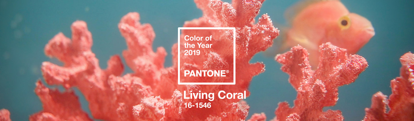

2019 Color of the Year: Living Coral Living Now
A bit about the color
Living Coral was announced as Pantone’s 2019 Color of the Year. Having been captivated by technology over the past decade, we’ve connected to the world online, yet often feel isolated and less connected. This color conveys both warmth and optimism through its use. We’ve seen it used in clothing, lip colors, branding, nail color, and almost every website banner recently.
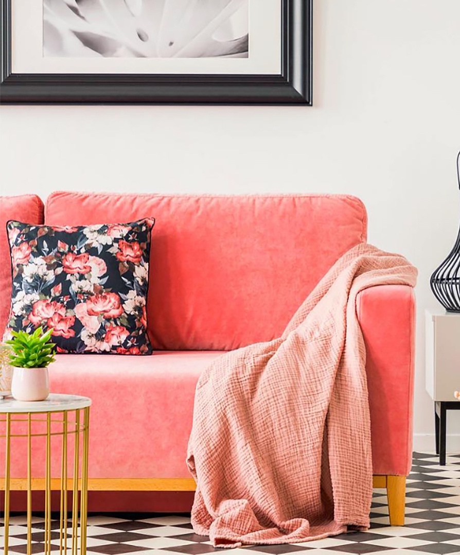
This hue is a beautiful mix of orange and pink creating a lively and happy color. We’ve seen the essence of this color go from very pale salmon color to a vibrant pink, to an orange-red and even rust. Being analogous on the color wheel, these colors coordinate very well within the same space creating an almost desert sunset palette.
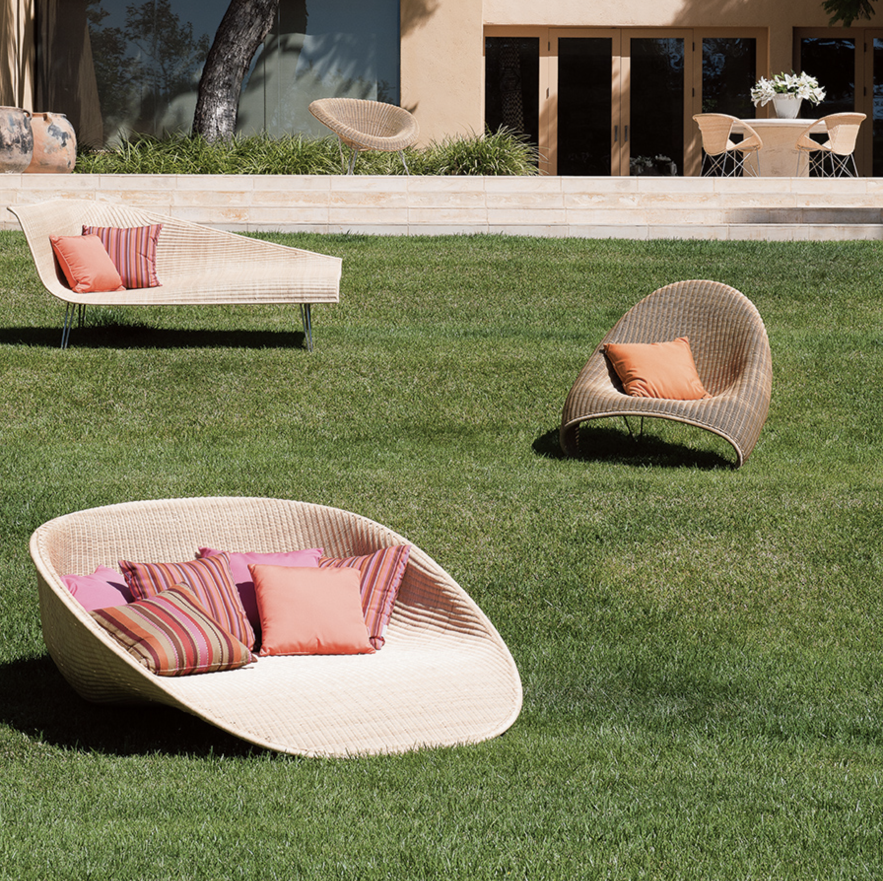
Coral outdoor pillows toned down with warm tones and tan. Janus et Cie – Fibonacci
If you think the color is trending more toward being too feminine, it can be used as a small accent with a combination of neutrals to pull it back down to earth, like olive, concrete, bark, gray, and marine.
How to use Living Coral
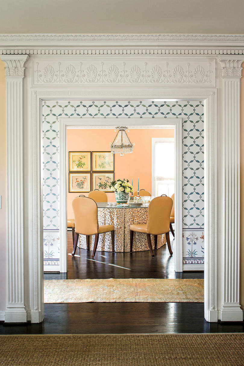
So how can Living Coral be used? We love it as an accent wall in wallpaper or fresh paint or as a pop of color in a piece of wall art.
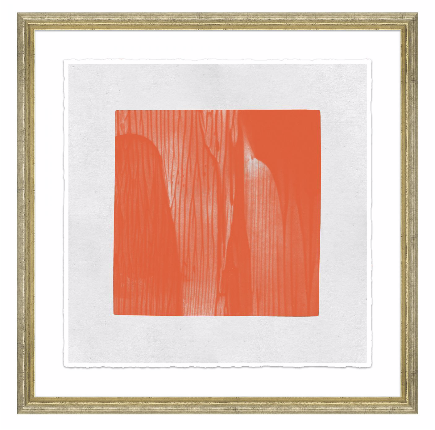
Curated Kravet – Brush Strokes 20″ x 20″ $490
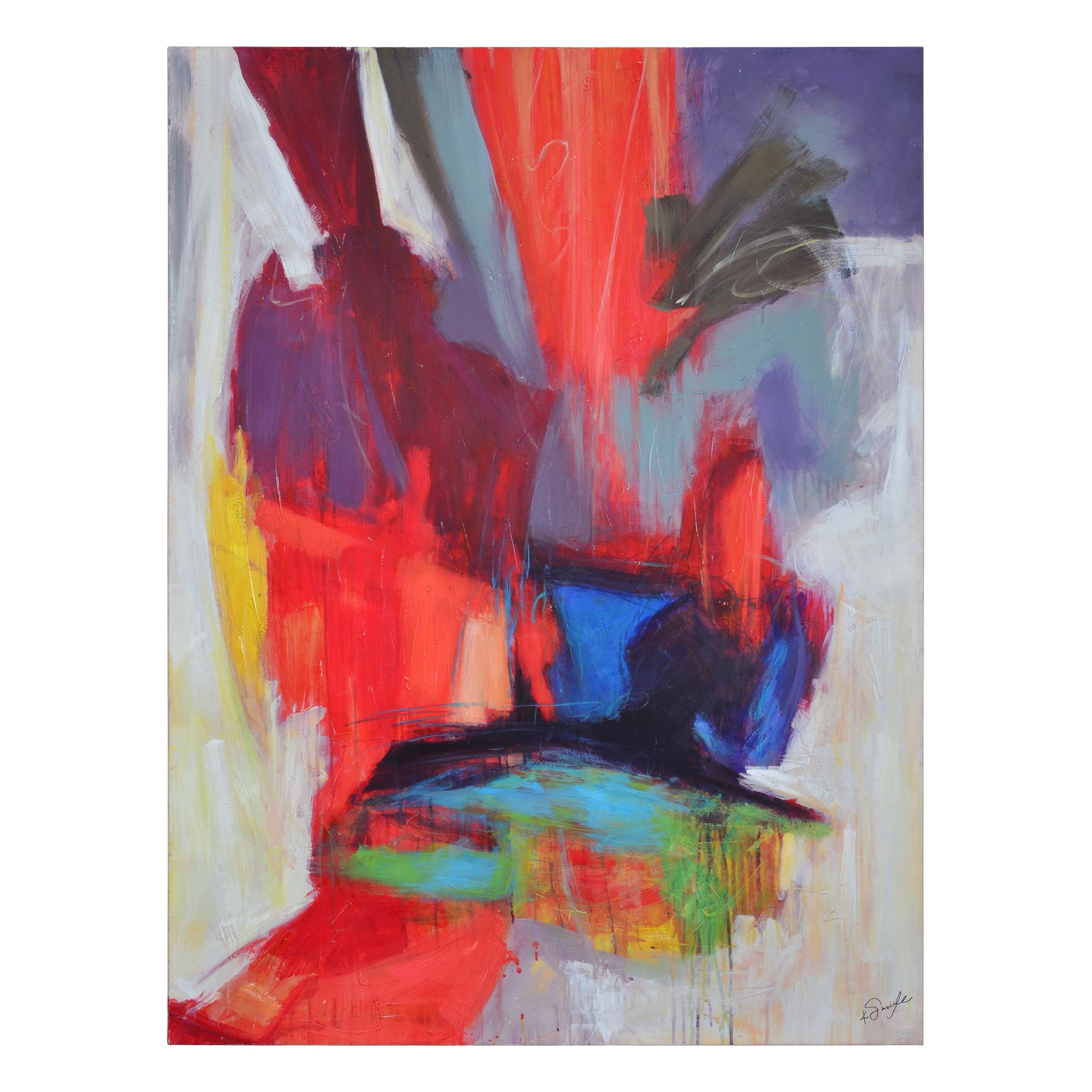
Renwil – Rosy Plumes 45″ x 60″ $358
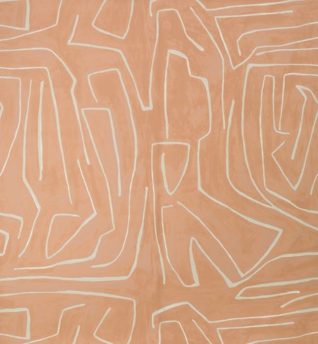
A pale version in an abstract wallcovering pattern. Kravet by Kelly Wearstler – Graffito in Salmon/Cream $570/2 roll set
A peppy grasscloth texture. Thibaut Regatta Raffia in Pink Coral $340/double roll
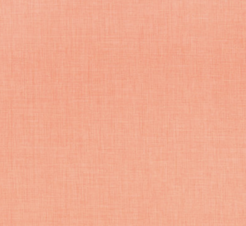
Pale Salmon Walls – Southern Living – photo by Lauren W.Glenn
Living coral velvet – Daninoce.com.br (photo by @create.perfect)
Sumptuous hide rug with coral accents.
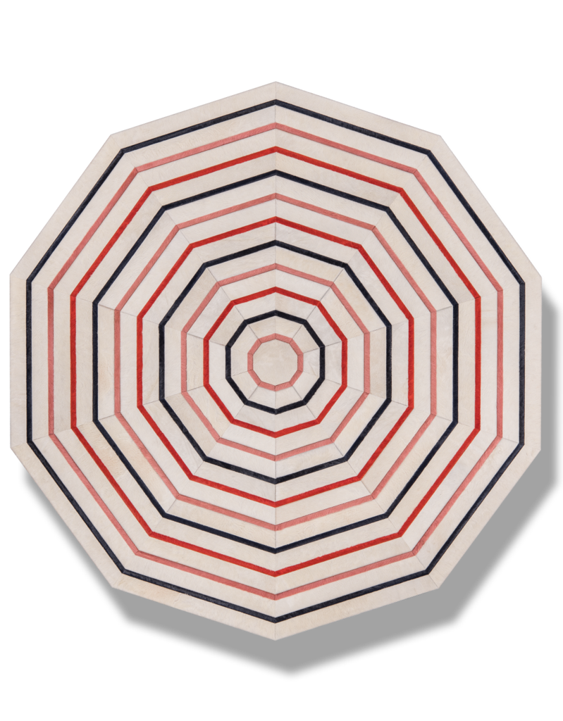
Kyle Bunting – Nice Rug 8′ dia. $5000 (available in other sizes, through your favorite designer)
For commercial interiors, we like some bright pops in the furnishings like the chairs below.
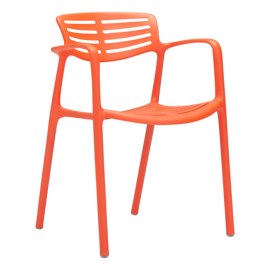
Janus et Cie – Toledo in Flamenco
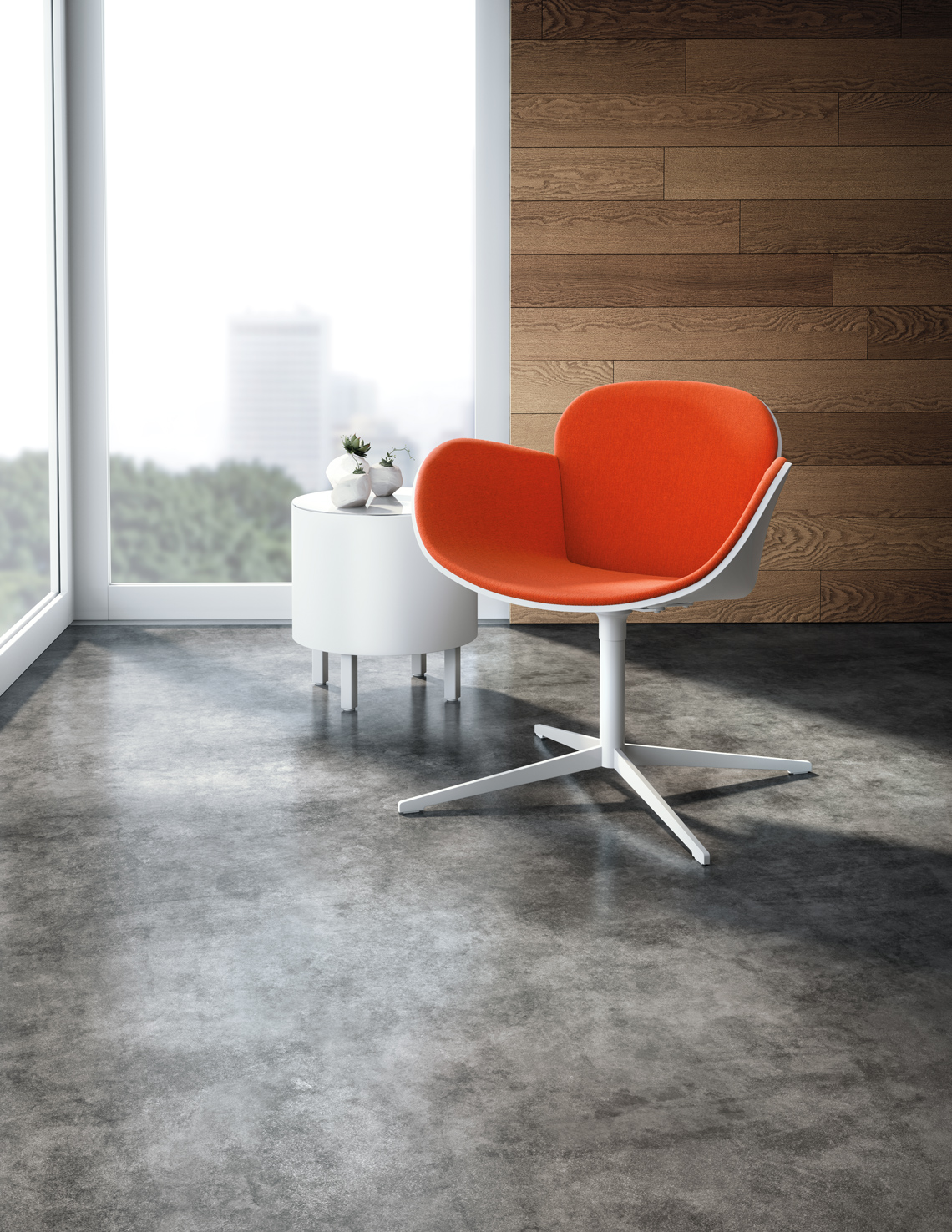
Kimball – Splendor
Next, take a look at the way the color has been used in restaurants.
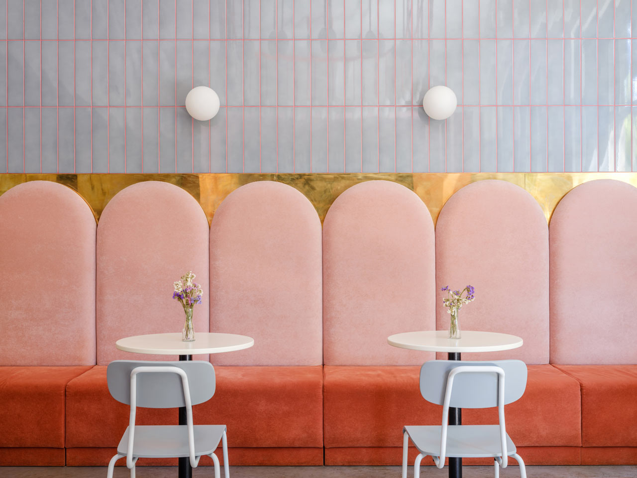
Breadway café in Odessa, Ukraine (via Design Milk)
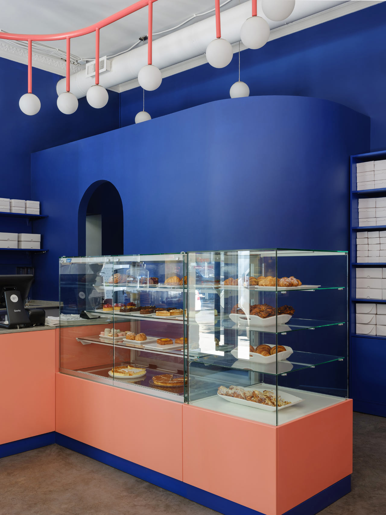
The bakery’s sales area has more contrast and each color intensified since they are color wheel opposites. Breadway café – Odessa, Ukraine
What a difference an accent color makes! Notice the difference between the image above and below using a very close tone of coral.
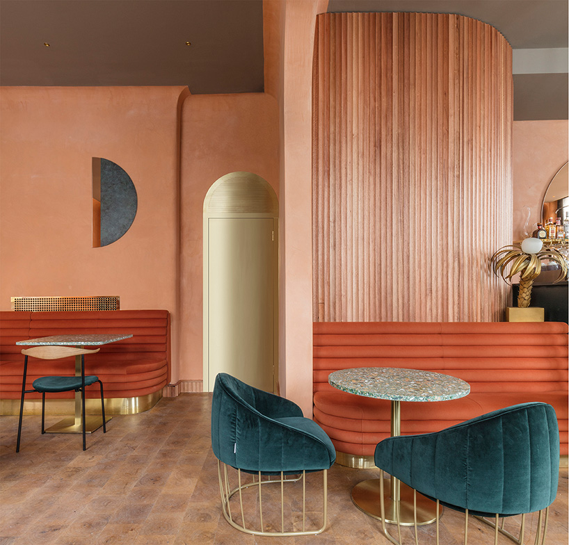
Warm and subdued with neutral wood and deep marine at Omar’s Place, London – Sella Concept/Wilson Holloway (photo by Nicholas Worley)
In conclusion, I hope you find a way to incorporate Living Coral into your space. Send me a photo if you do!
Written by Emilie Kyle
Lush Interior Design LLC is a Hospitality, High-end Residential, and Commercial interior design firm located in the Washington, DC area. Lush specializes in elevating brands through beautiful and functional interior design to make the most impact on guests and users of each space. If you are a restauranteur, hotelier, creative brand, or association and want the Lush team to manage your interior design project, book a complimentary Discovery Call to discuss how we can help!
 (1)")


