


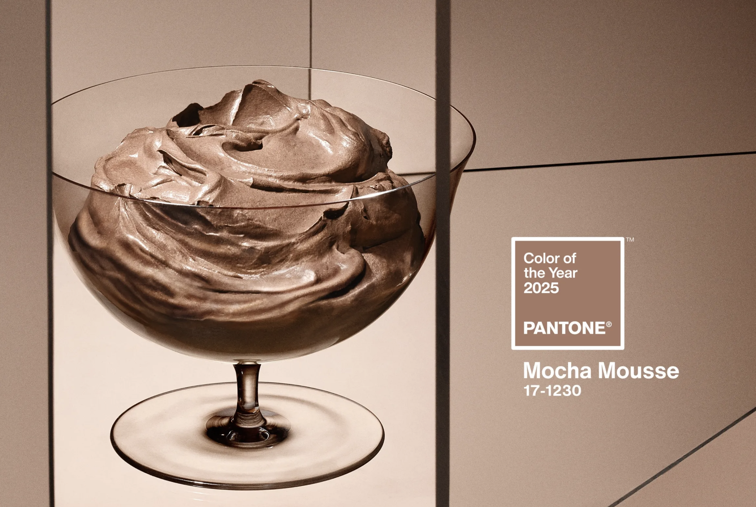

2025 Color of the Year: Mocha Mousse
What colors come to mind when you think elegant, comfort, grounded, soft, harmony, rich, warm, content, and indulgent? Might it be a deep green? Deep oxblood? Brown?
If your mind went toward a specific rosy brown, you’d be correct. Mocha Mousse to be exact.

As you probably know by now, Pantone selects a Color of the Year based on numerous things going on in the world around us. For 2025, the color that was selected is Mocha Mousse, a color that “[captures] a global mood of connection, comfort, and harmony,” Pantone. Check out my previous posts on past year’s Color of the Year for 2016, 2017, 2018, 2019, and 2023.
Pantone’s panel of color experts look at where we as a culture currently are, from the global mood to sustainability to technology to our appreciation of nature.
This rich warm hue helps comfort us with a hint of the feelings we get while consuming chocolate and coffee.
This color lends itself to being part of an array of other neutral colors and being grounded as a nice base color or standing alone in elegance. It plays a chic supporting role with brighter or lighter colors.
This post links to both affiliate and directly to a retail component of our business and we will earn compensation from your purchase. This compensation helps with expenses to keep this blog up and running. Thank you; we appreciate your support!
How Mocha Mousse is Being Used in Fashion & Beauty
Now that you know a little more about Mocha Mousse, you probably are looking at ways you can jump into using it in your life.
In fashion, think Kim K’s latte dressing trend and Hailey Bieber’s latte makeup looks. Latte dressing came about in 2023 and is head to toe monochromatic milky latte to fully mocha dressing with several sophisticated neutrals in between. Kim’s brand, Skims has a ton of neutral shapewear and loungewear options.
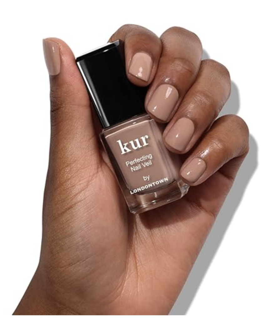
In beauty, I’ve been seeing nude nail colors that match or contrast skin tone. This is an easy, low commitment way of bringing this color into your life.
How to Use Mocha Mousse in Your Home
With interiors, we’re already seeing the fading of gray (Pantone’s COTY for 2021 was Ultimate Gray) as a safe neutral, with more upholstered pieces in this neutral hue. I love the idea of Mocha Mousse as the starring neutral with other colors as accents or hints of this hue to help ground more vibrant tones.
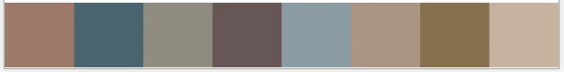
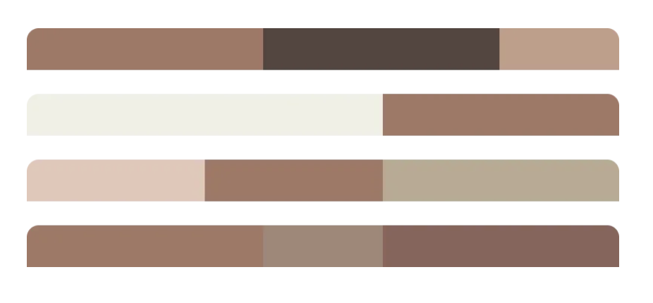
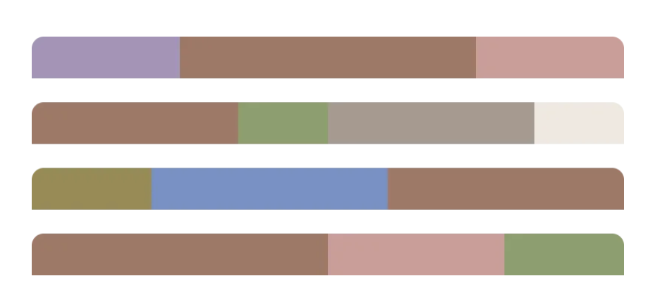
If you’re wondering how to combine this grounded, soft neutral, Pantone pulled together five distinct color palettes that are sure to get your creative juices flowing.
Pulling in a muted inky blue, a soft greenish gray, soft aubergine, stone, and khaki in similar values.
For an upscale luxe feel, pair Mocha Mousse with soft cream, a deeper soft cool brown, or pinky-beige.
We’re loving seeing Mocha Mousse paired with cornflower, a soft spring green, lavender, rose, and soft white.
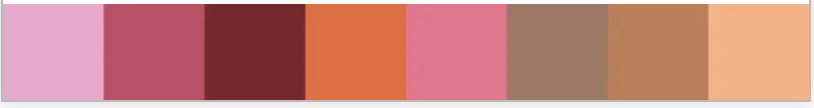
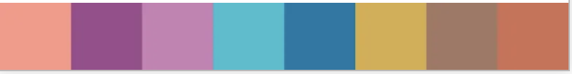
If you like brights, the next two combinations are for you.
This combo of deep rose, Barbie-pink, soft apricot, Mocha Mousse, bright orange, and brick reminds me of panoramas of a desert, but Pantone says it’s delectable confections.
Teaming grounded Mocha Mousse with marigold, soft rust, turquoise, vibrant purple and pinky coral provides an exotic feel without being over the top.
Ideas and Items to Incorporate into Your Interiors Right Now
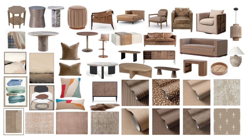
From artwork to rugs, wallpaper to swirly marble tables, lighting to accessories, I’ve got fifty items in my shop that will have you covered.
Seven More Ways to Use Mocha Mousse
Lets dig into seven more ways we are suggesting this beautiful color to be used.
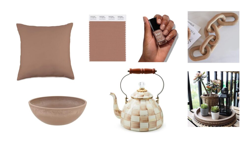
If you really want to nail the color, order an actual Pantone fabric swatch so you have it to reference as you pull other colors for your home.
Did you know you can type into Amazon’s search bar the name of the color of the year and there is a long list of coordinating products? You can do this every year if you just want a round up of specific Pantone hued items. This simple throw pillow above is linked here and comes in two sizes.
If you’re looking to bring the outdoors in, we always say houseplants are a great way to add greenery, dimension, and more life inside. This shallow planter is perfect for housing a bonsai, or a grouping of succulents.
A very simple and versatile accessory for a coffee table or bookshelf is a marble or wood chain link this one.
We love styling with trays like this beaded round tray. Grouping like items together helps keep things visually organized.
And finally, if you liked the style of the classic Mackenzie-Childs but thought the black and white Courtly Check was too contrasty for the rest of your kitchen, you will love this neutral (and new!) Mocha Check color way shown on a beautiful enamel tea kettle.
Hopefully one of the over 50 ways to use the color of the year, Mocha Mousse, piques your interest in using this color. In the comments below, let me know what you think of the 2025 Color of the Year. I’d be interested in your thoughts and how you think you may incorporate this versatile color into your home and lifestyle over the next year.
Written by Emilie Kyle
Lush Interior Design LLC is a Hospitality, High-end Residential, and Commercial interior design firm located in the Washington, DC area. Lush specializes in elevating brands through beautiful and functional interior design to make the most impact on guests and users of each space. If you are a restauranteur, hotelier, creative brand, or association and want the Lush team to manage your interior design project, book a complimentary Discovery Call to discuss how we can help!
 (1)")


